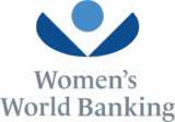
I’m so excited to introduce our new logo and website today! For more than 35 years, we have been the authoritative resource for the needs of low-income women. In the evolution of our work, we are serving more women than ever before with the essential tools and resources that allow them to build security and prosperity for themselves and their families. It is this tremendous growth that created the opportunity to refine our brand positioning and how we communicate about the work we do.
Our new logo was inspired by the 4 concepts that you see here:
- A flower, representing women
- The globe, representing our network and our reach around the world
- The coin, dropping in a purse to symbolize the concept of saving
- A woman, feeling empowered
It is always difficult to let go of a visual identity that has served you well for so many years. We see this as a natural transformation as you can see in the animation below:
We hope you see the vitality and optimism of our organization in our new logo. On our website, you’ll be able to easily find information on our product innovation, leadership programs, how to get involved, and much more. Please take a moment and provide feedback to us by sending us a Tweet at @WomensWorldBnkg.
Finally, I’d like to say a special thank you to our brand strategist David Boorstin and design firm Chermayeff & Geismar & Haviv for working with us on this initiative.
Enjoy!


